
1st Week of Bootcamp Complete!!

Week 1 of coding bootcamp down! The experience has been amazing. Great people, amazing teachers, and a wonderful environment. I feel it in my bones that I have made the right choice.
There are so many opportunities to get your hands dirty and code, which in this field is key. Friday night I completed the first easier homework assignment, which was working with containers. See the code pen below. I encourage you to look at the code and play with it. That is the only way to learn!
See the Pen Bootcamp_1.2_Container Assignment by Nigel Finley (@Nfinleymusic) on CodePen.
In order to 'commit' what I have learned to memory (remember the earlier git pun?), I wanted to share a few things that I found interesting in class today.
WHAT IS CSS?
CSS stands for Cascading Style Sheets (because the browser interprets what you code going from top to bottom - over simplified but the idea). You can attach these .css sheets to your webpage via a relative link within your .html file and style your html pages to make them look really nice.
Think of HTML as your framework or foundation for your webpage and think of CSS as your paint, floor type and interior design and finish.
How it works (in a nutshell)
CSS works by calling up a HTML selectors, choosing which property of that selector to manipulate and assign a value to that property. When the browser renders the CSS it starts at the top of your .css file and moves down the page, hence 'Cascading.' When a styling conflict occurs generally the last piece of CSS written will win. See the image below for the syntax of CSS.
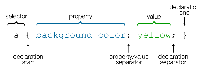
- Selectors identify which piece of your html you would like to style. This includes: Elements (
header,body,footer, etc.), Classes(designated by a.before the selector name) and IDs (designated by a#before the selector name) - Properties state what 'property' of the selector to be modified. This includes things like:
font-family,color,background-image, etc. - Values state result given to the property like
Arialorblueorurl(filepath).
One trick: You can use use the value !important to ensure a styling is not overwritten when the browser renders.
One tip: Always use a rest.css file contained within your html head(Reset File). This ensures that all browser-specific css has been reset, giving you a clean slate to create cross-browser compatible websites.
Box Model
The box model gives a standard definition of how properties such as padding, border, margin and position affect your content. This is a key piece to know as it affects every piece of content you style with CSS. It allows you to have ultimate control over for micro-positioning.
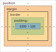
You will see this box model within the chrome developer tools and as you hover over each element, the box becomes responsive indicating size of each piece.
The first exercise we did in class to help understand the box model as seen here on Code Pen.
See the Pen Bootcamp_1.3_Float Exercise by Nigel Finley (@Nfinleymusic) on CodePen.
---CSS Positioning
There are certain CSS properties that you can use to help position your content on your page.
position: static = Boxes with this position value are not really “positioned” as they simply appear in the order or 'flow' that they occur within the markup and take up as much room as needed. This position is the default behavior when no CSS is applied.
position: relative = This positioning places boxes within the normal 'flow' just like any static element, however the relative box is shifted according to the top, bottom, left, and right properties. The key here is to understand that movement for a property selected happens from that properties edge of the box not the direction of the movement. For example left:20px; actually means move the box 20px from the left edge, effectively moving it right.
position: absolute = Unlike static and relative positions, absolutely positioned elements are removed entirely from the document 'flow'. This means these boxes have no effect on their parent element nor any CSS stylings that come afterword.
position: fixed = This position type is just a special form of absolute except that they are 'fixed' relative to the viewport/browser window rather any any parent element. They stay in exactly the same spot even if the page scrolls, which could be helpful for say footers.
There are great tutorials to help grasp the concept of positioning:
- W3.Org - Static and Relative
- [W3.Org - Absolute and Fixed]((https://www.w3.org/wiki/CSS_absolute_and_fixed_positioning)
- Learn Layout
Hiding things can also be fun. There are two CSS stylings we learned that can help to play hide and seek:
display:none = hides the elements and not actually drawn within the webpage
visibility:hidden = hides the elements but does draw the element and it takes up space and is still within the flow
See the example below of a few different positioning properties at work. Again play with the #fixed, #relative, and #absolute values in the CSS to see the change tale place.
See the Pen Bootcamp_1.3_CSS Positioning Assignment by Nigel Finley (@Nfinleymusic) on CodePen.
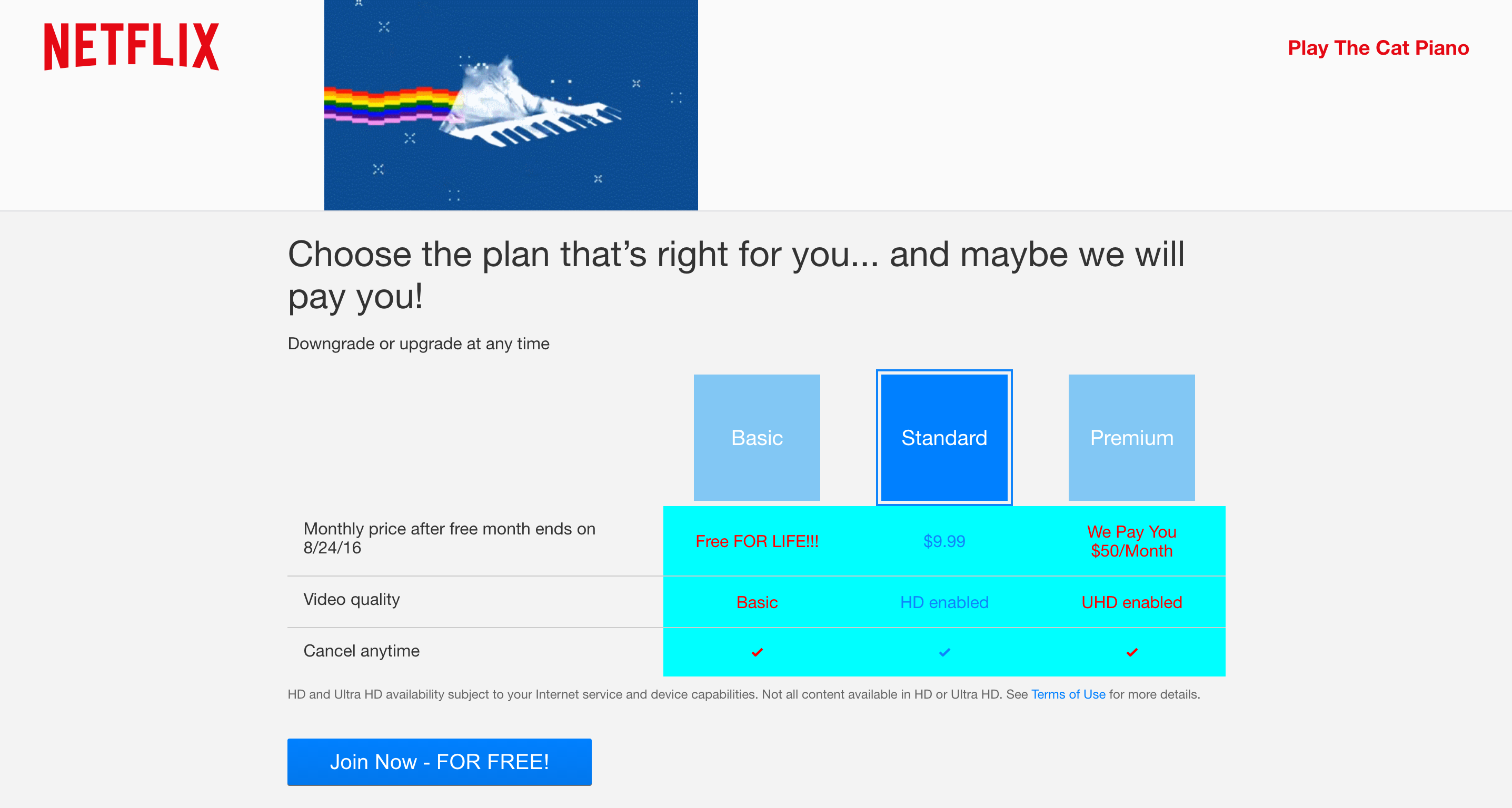
Another Tip: Use the 'Inspect' feature in the Google browser to play with your html and CSS.
Within this inspect feature you can change everything even make something cost no money, like a free subscription to Netflix or even a subscription where they pay you:
Here is too one week down and no matter where my journey goes from here, I am excited to be on a new path!!